Before user feedback

After user feedback


You’ve decided to start working out where do you begin?
Workout is designed to let you create and follow your own workout routines. It keeps a record of workout data to help you see just how well you’re progressing. You can choose from a menu of exercises to put together a custom plan which you can follow at your own pace.


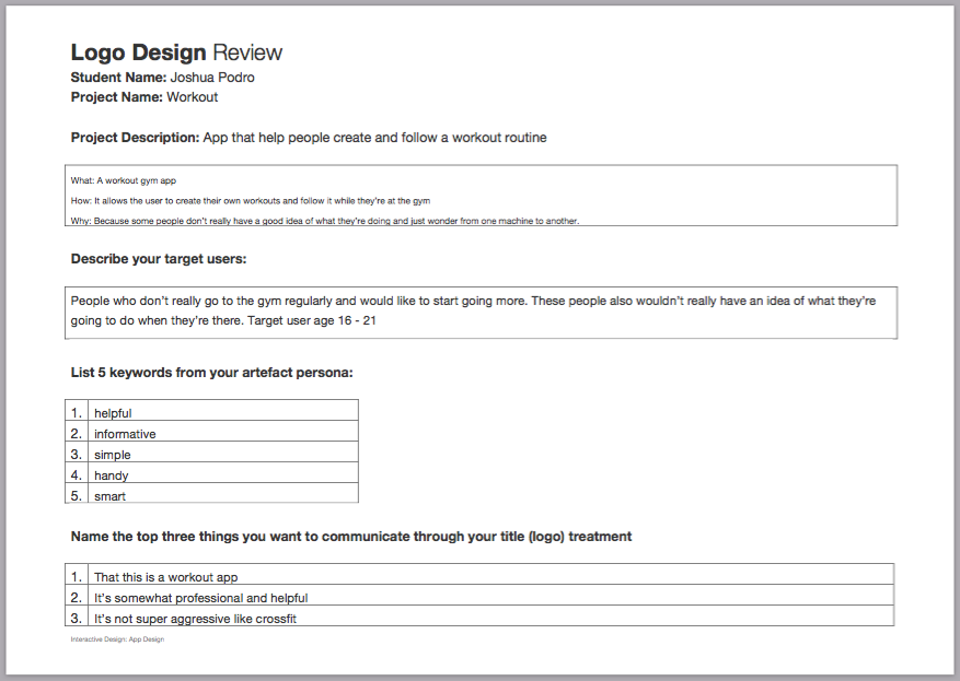
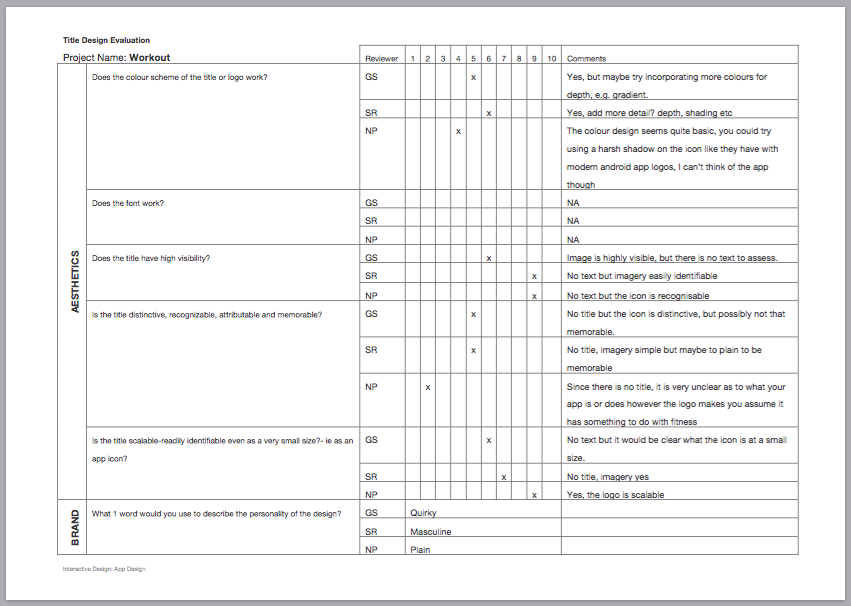
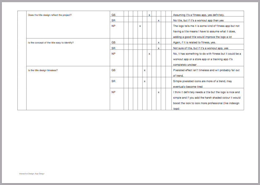
On the left is the first iteration of the logo for work out which after feedback later developed into the logo on the right.


There are two main components to a tray:

Having most of the options and links in theThis can make the tray into the one stop area for accessing content.


Navigation buttons are used to return the user one space back in the experience.

There shouldn’t be any dead ends to a users exploration to ensure this we must make your last Page actionable.
To do this there are 2 methods:
Good Design: The List
This weeks lecture pod allowed me to have a better understanding on different UI elements. Having a better understanding on what should and shouldn’t be in different UI elements will aid in the development of my app. For my app I will most likely be using the List element.
A scenario is a narrative describing foreseeable interactions of types of users and your product. Scenarios include information about a users goals, expectations, motivations, actions and reactions.
Scenarios are neither predictions nor forecasts, but rather attempts to reflect on or portray the way in which a system is used in the context of a daily activity.
User scenarios predict how certain types of users represented by your personas will interact with your product in a given situation in order to complete a give goal. User scenarios allow you to test your product structure before its fully developed and isolate problems before they become problems.
Scenarios should at least outline the:
User scenarios should be born from your user personas. you need to start with qualitative research so you can look for patterns in behaviours, goals among people how fit your user persona. out of this information you can better understand how a user may use your product and what goals they may have when using it.
As interactive designers it’s important to understand the process of using personas and user scenarios and a context to drive a design.
Week 5 & 6 lecture pods have showed me just how important it is to identify and understand the type of people you’re designing for. They have showed me that developing user personas and using them in scenarios is the best way to see how the product will be used. Scenarios can also be used to identify problems what you may have over looked. These two lectures have showed me just how important it is to create user personas and user scenarios during the development of my app.
User personas are fictional users representative of a real user. User personas are a representation of the goals and behaviour of a hypothesised group of users. They are synthesised from data collected from interviews with users. That are captured in 1-2 pages descriptions include:
Here is an example of a user persona which should include the users:
The goal of defining these details is to establish the mindset and desires of the user. Personas are not only useful in the design process but also at the end to validate your wireframes to see if meeting your user’s goals.
First we must establish who is your core audience and who is your fringe audience? Your design should satisfy your fringe audience but keep the focus on satisfying your core audience.
Are there different tasks for different personas?
Different personas take different paths
Are they expecting a cross platform experience?
Users who want to browse vs. users who want specific content.
Mental Models are what thoughts people from around an idea and activity. They vary from person to person.
2 examples mental models for taking a note:
Mental models illustrate how your users approaches a particular problem.
As a way of thinking about the proposed official design of the product. They are useful for client meetings. To develop an artefact persona you’d ask product personality questions such as:
Also it’s important to choose experience keywords that would define and govern the visual strategy. experience keywords represent the initial 5 second emotional reaction that the archetypal persona should feel when viewing the interface.
This week’s lecture pod helped me understand just how important personas are when designing an app. It showed me just how much insight can be drawn from a simple user persona. It can help the designer see how the user may be thinking. This lecture will help be in creating my very own personas for my app
In order to really understand the smartphone you need to actually use the smartphone. Planning for an app on ios you should always practice using an iPhone and the same goes for android. This is because each platform has a set of unique elements, terminology, and device characteristics.
The Tap
The tap is the building block of IOS platform. Usage of pressure sensitive glass enables the finger pressure of the user to come in contact with the screen. Minimum of 44 x 44 pt active area.
The Drag
The Drag uses the touch gesture to scroll walk. It combines push and the movement of finger to move an onscreen element.
The Flick
The flick is like the drag but flick allows for a lighter touch for quicker and less directed movement.
The Swipe
The swipe is based on using a large finger contact area for directed on screen movement. It’s meant for slower and more controller interaction.
The Pinch
The pinch allows for finger interaction to control zoom in and zoom out. Pinching inwards to zoom in and Pinch outwards to zoom out.
Random Gestures
There are lots of different gestures, for example, one of the most random gestures is the shake.
Bars
Bars tell users where they are and helps users navigate or initiate actions.
Content Views
Content views contains app specific content and can enable behaviour such as scrolling, insertion, deletion and rearrangement of items.
Controls
Controls perform actions or display information.
Temporary views
Temporary views appear briefly to give users important information or additional choices and functionality.
The Keyboard
There are different keyboards for different tasks depending on the user’s needs, for example, text, email, phone or URL.
Pickers and Date Pickers
This element allows for larger contact area for touch gestures making it easier to pick selection options.
Inputs
Inputs are app specific, the slider and the switch. These input methods can be used to create interactive message when selecting choice and images on the screen.
Tab Bar
The tab bar is one of Iphone’s signature navigation element for apps. It replaces tradition tabs found on most webpages with a language of icons small titles.
Navigation Bar
Native app navigation feature. The navigation bar plays a critical role using lists and pages in IOS.
The Tool Bar
The tool bar sits at the bottom of the screen and acts as a general placeholder for icons and text. The role of this element is to support the current view or page by providing secondary navigation.
The Action Menu
The action menu allows for secondary navigation within an app.
This should give a people a slightly better understanding of the anatomy of IOS. This lecture pod helped me to better understand the different elements that need to go into consideration when making an app. I now know that when developing my app I should keep some of these gestures and UI in mind.


On the left is the current Western App’s menu on the right is my re-design
Both app designers and developers have been through a lot of trends while the look, functionality and the tools to develop apps have changed. The process in which we develop and design an app has stayed the same.


Questions you must ask
Once you feel satisfied with your idea it’s about time you put things into writing.
Link to a helpful wire framing tool
I feel like this article is good for people looking into the process of designing an app the reasoning behind each step. as an up and coming designer, I think we should try can help people understand that design is about the continual process, not just making things look nice. This article helped me better understand the design process behind the development of an app. I also found it helpful in my own process of developing my app.
Joey has been going to the gym the past few weeks because he wants to get fit. However, when he goes he never has a set plan of what he’s going to do when he gets there. He really wants to create his own routine so that he can get in and out instead of walking about and hopping on whichever machine that he feels like going on at the time.
Joey looks for some apps that might help him with this problem and he finds “Workout” he installs the app on his phone to try it out. He presses create own workout. The app suggests machines to help him in create his workout routine. He selects treadmill 10 mins and rower 5 mins and as a warmup. After his adds different weight machines and sets the amount of reps and rest period for each as well as the weight limit. After doing this the app shows the estimated amount of time that this workout will take 1 hour.
He goes the gym and does the routine following with what’s displayed on the app. He presses done after completing each (exercise?). when’s he’s finished Joey decides that he enjoyed this routine and decides to keep it for next time.

